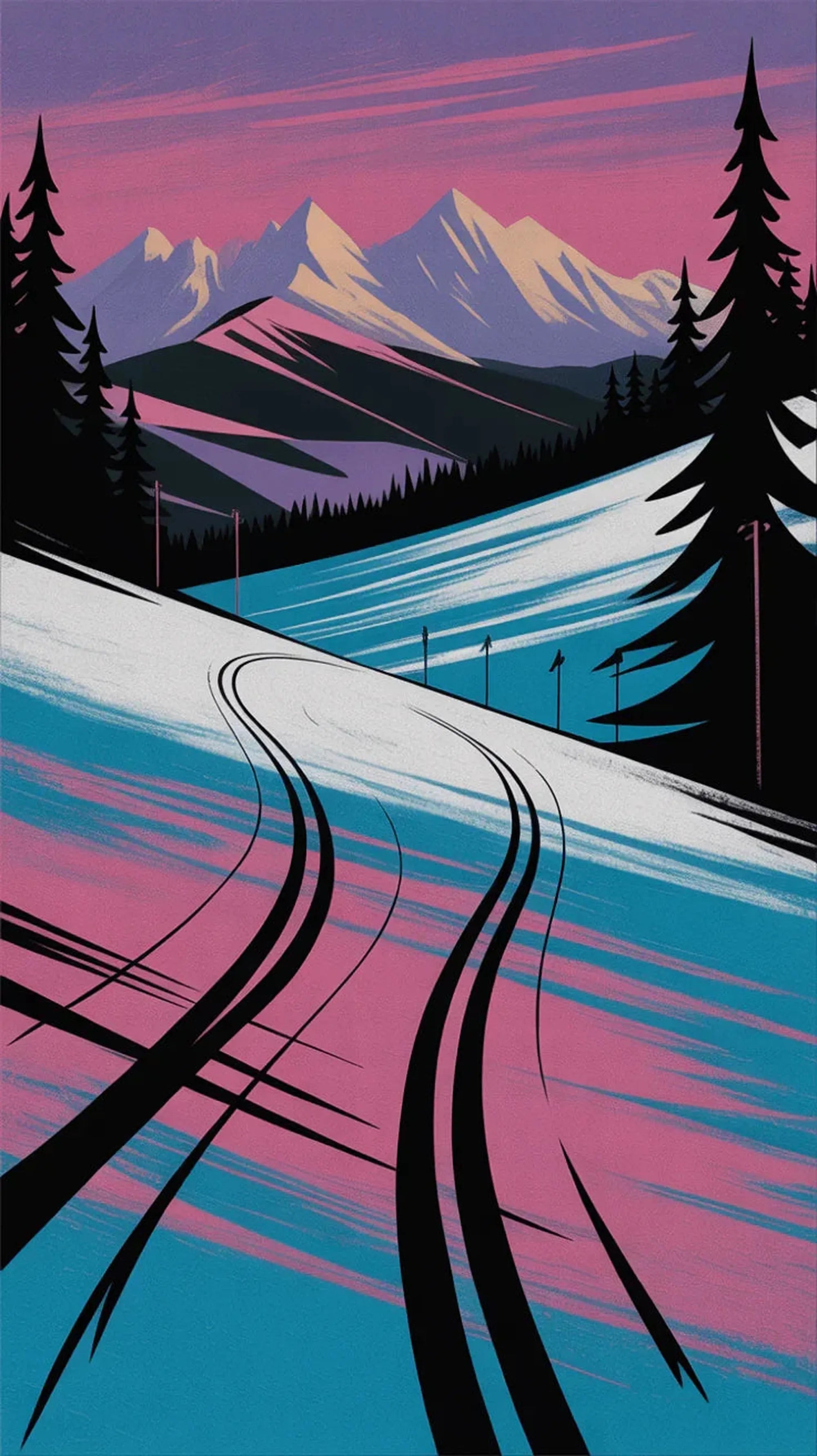
Modern alpine racing is a lab experiment that learned to walk. There are wind-tunnel suits, aerodynamics that could land a small plane, and skis with more sidecut than your barber. Respect. But if you grew up when neon was a personality trait, you know the golden era: the 80s/90s, when downhillers dressed like sentient freeze pops and bombed a mountain like they were late for a mixtape. That’s the energy stitched into our Old-School Ski tee: speed with swagger, geometry with jokes, goggles with a god complex.
How the Olympic look got LOUD (and why TV loved it)
- Angles that attack: Triangles, chevrons, and speed lines built out of halftone dots—graphic designers drew “vrrrrm” noises and the tailors made them wearable.
- Mirrored goggles: These weren’t accessories; they were portable album covers. Every shot was an opportunity to reflect a mountain, a helicopter, or your own greatness.
- Patch mania: Flags, brands, federations—if there was an empty square inch, a patch moved in and started a family.
- Lycra with opinions: Yes, some suits told the world a little too much about the athlete’s… biography. But when the clock’s counting hundredths, humility is a luxury item.

Under the neon: the real tech of the time
It wasn’t all look-at-me. Wax wizards were cooking fluoros (RIP, sweet chemicals) to squeeze a second out of sleet. Sidecuts evolved, base grinds got smarter, and padding got less medieval. If you ever wondered why a 90s GS run looked like a samurai carving calligraphy across ice, that’s tuning culture. Our tee borrows the clean lines and angled thrust from those graphics—minus the need to stretch before you put it on.
Retro Olympic design rules (the quick decoder)
- Contrast = speed: If the colors fight each other, the skier looks faster.
- Geometry ≈ drama: Hard edges read as aggression. Good for TV. Good for your chest.
- Goggle mystique: Mirror tint equals mystery equals “That person skis like they rob banks at altitude.”
How to wear it without face-planting your dignity
- Layer like a lift ticket: Tee, flannel, puffer. Boom: mountain-bar owners nod at you for reasons unknown.
- Mirrored sunlies: The goggles can stay home. Sunglasses do 70% of the work; confidence does the rest.
- Après philosophy: You didn’t have to race. You just had to look like gravity owes you money.


